Blogs
Blogs  Leap Digest
  Events
  About Us
 Volunteering in the UK Line Graph: PTE Describe Image Question with Sample Answers - Page 2
Your task
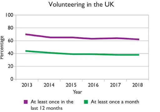
Look at the graph below. In 25 seconds, please speak into the microphone and describe in detail what the graph is showing. You will have 40 seconds to give your response.

30 community answers with AI feedback
30 community answers with AI feedback
SCORE 14/16

AI Feedback
AI Feedback
Content:
The description identifies the overall topic and covers most key elements, mentioning the purple and green lines, the time frame, and the trend of volunteer percentages. However, it lacks a detailed explanation of relationships between the lines.
Oral Fluency:
Speech is smooth and natural, with a good pace and no hesitations.
Pronunciation:
Pronunciation is mostly clear with minor errors, but overall understandable.
SCORE 14/16
AI Feedback
AI Feedback
Content:
The user identified the overall topic of the graph and described several key elements, including trends and specific years. However, some details were vague, and not all relationships were fully explained.
Oral Fluency:
Speech was smooth and natural, with a good pace and no noticeable hesitations.
Pronunciation:
Pronunciation was mostly clear with minor errors, but overall articulation was good.
SCORE 14/16
AI Feedback
AI Feedback
Content:
The overall topic of volunteering numbers in the UK is identified, but only about 40-59% of the key elements are accurately described. Relationships between the two types of volunteering are weakly explained, lacking detail on trends and comparisons.
Oral Fluency:
Speech is smooth and natural, with no hesitation or disfluencies affecting the overall flow.
Pronunciation:
Pronunciation is highly proficient with clear articulation throughout the response.
SCORE 14/16
AI Feedback
AI Feedback
Content:
The user identified the overall topic of the line graph and described key elements, including the x-axis, y-axis, and the two lines representing different volunteering frequencies. However, the explanation of relationships and trends between the elements was somewhat limited, preventing a higher score.
Oral Fluency:
The user spoke smoothly and naturally with no noticeable hesitations, maintaining a good pace throughout the description.
Pronunciation:
The pronunciation was mostly clear with minor errors, such as 'volumetering' instead of 'volunteering', which did not significantly hinder understanding.
SCORE 14/16
AI Feedback
AI Feedback
Content:
The overall topic of the image, which is the relationship between volunteering in the UK, is identified. The user describes key elements like the x-axis (years) and y-axis (percentage) but misses some minor details. They mention the purple and green lines and their meanings, indicating some relationships, but could elaborate more on trends over the years.
Oral Fluency:
The speech is smooth and natural with no significant hesitations or disfluencies, maintaining a good pace throughout.
Pronunciation:
The pronunciation is mostly clear with some minor errors in word accuracy, particularly with 'voluntary' which should be 'volunteering'.
SCORE 14/16
AI Feedback
AI Feedback
Content:
The user identified the overall topic and described several key elements, including percentages and time periods, but missed some details and relationships between the elements, such as specific trends in volunteering over the years.
Oral Fluency:
The speech was smooth and natural with no significant hesitations.
Pronunciation:
Pronunciation was mostly clear with minor errors, allowing for good comprehension.
SCORE 14/16
AI Feedback
AI Feedback
Content:
The response includes some accurate simple descriptions and basic relationships, but they may not adequately cover all the main features of the image.
Oral Fluency:
The oral fluency score is excellent, demonstrating a smooth and coherent speech pattern with no disfluencies.
Pronunciation:
The pronunciation score is very high, indicating clear and accurate articulation of words.
SCORE 14/16
AI Feedback
AI Feedback
Content:
The overall topic is identified, and most key elements are described correctly, including the axes and lines. However, some relationships and trends are not fully explained.
Oral Fluency:
The speech is smooth and natural with no hesitation, demonstrating good fluency.
Pronunciation:
Minor pronunciation errors are present, but the speech is mostly clear and understandable.
SCORE 14/16
AI Feedback
AI Feedback
Content:
The user identified the overall topic and described key elements such as the x-axis, y-axis, and color coding for volunteer percentages. However, some details were unclear, and relationships between elements were not fully explained.
Oral Fluency:
The speech was smooth and natural with a good pace, showing no disfluencies.
Pronunciation:
Pronunciation was mostly clear with minor errors, but overall intelligibility was good.
SCORE 14/16
AI Feedback
AI Feedback
Content:
The user identified the overall topic of the graph and described key elements, including the two lines representing different frequencies of volunteering. However, some details were unclear, and the explanation of the relationship between the lines was somewhat vague.
Oral Fluency:
The speech was smooth and natural, with a good pace and no disfluencies.
Pronunciation:
Pronunciation was mostly clear with minor errors that did not significantly hinder understanding.
How to approach it
- Name the image. Say what type of chart or picture it is and what it measures.
- Give the overview first. State the highest and lowest, or the main idea, before any detail.
- Group, do not list. Cover two or three key points. Never read every number.
- Close with one comparison. End on the biggest contrast or the main takeaway.
Model Answer
as we can see here there is a line graph where volunteering in the uk is the topic where from the year 2013 to 2018 at least once in the last 12 months and at least once in a month significantly it is declining with the flow of 40 percentage and 65 percentage respectively. but there is a significant line where there is no fluctuation and it is a straight line where it is significantly declining till the year we reach around 2018.