Blogs
Blogs  Leap Digest
  Events
  About Us
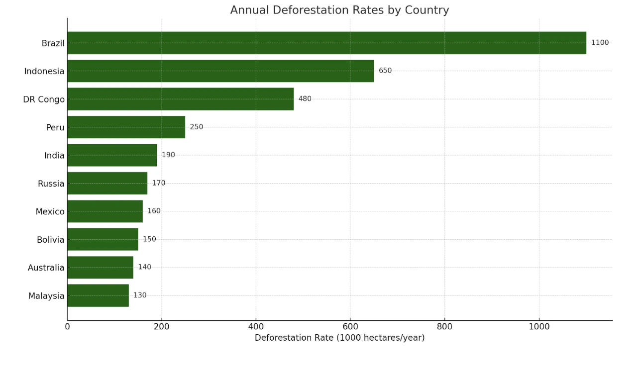
 Deforestation Rates by Country Bar Graph: PTE Describe Image Question with Sample Answers
Your task
Look at the graph below. In 25 seconds, please speak into the microphone and describe in detail what the graph is showing. You will have 40 seconds to give your response.

30 community answers with AI feedback
30 community answers with AI feedback
SCORE 15/16

AI Feedback
AI Feedback
Content:
The response describes the image accurately, identifying the main features and relationships, allowing a listener to build a complete mental picture.
Oral Fluency:
The fluency is highly proficient, with a good words per minute rate and no disfluencies.
Pronunciation:
The pronunciation is highly proficient with a high word accuracy percentage.
SCORE 15/16
AI Feedback
AI Feedback
Content:
The user accurately identifies the overall topic of the bar graph and describes key elements, including the countries with the highest deforestation rates. Most relationships between the elements are mentioned, particularly the ranking of countries, but some minor details are missing.
Oral Fluency:
Speech is smooth and natural, with a good pace and no noticeable hesitations.
Pronunciation:
Pronunciation is clear with accurate articulation of words, allowing for easy understanding.
SCORE 15/16
AI Feedback
AI Feedback
Content:
The response accurately describes the main features of the image, identifies relationships among the data, and uses a variety of expressions and vocabulary effectively.
Oral Fluency:
The oral fluency score reflects a smooth delivery with a good pace and minimal disfluencies.
Pronunciation:
The pronunciation score is high due to clear articulation and minimal errors.
SCORE 15/16
AI Feedback
AI Feedback
Content:
The user identified the overall topic of deforestation rates and described Brazil's position accurately. However, only one country was mentioned, lacking coverage of other countries and relationships between them.
Oral Fluency:
Speech was smooth and natural with no significant pauses or hesitations.
Pronunciation:
Pronunciation was clear with minor errors, making it easy to understand.
SCORE 14/16
AI Feedback
AI Feedback
Content:
The overall topic of annual deforestation rates is clearly identified, and several key elements are described, including the countries and their respective deforestation rates. However, not all relationships and trends are fully explained, which prevents a score of 6.
Oral Fluency:
Speech is smooth and natural with a good pace, only minor pauses noted.
Pronunciation:
Pronunciation is mostly clear with minor errors present, but overall intelligibility is maintained.
SCORE 14/16
AI Feedback
AI Feedback
Content:
The overall topic of the image is identified as a bar chart showing annual deforestation rates by country. The user correctly described key elements such as the x-axis and y-axis, and mentioned the countries and their deforestation rates. However, the explanation of relationships, particularly the comparison between countries, could be clearer.
Oral Fluency:
Speech is smooth and natural with a good pace, showing no hesitation.
Pronunciation:
Pronunciation is mostly clear with minor errors that do not significantly affect comprehension.
SCORE 14/16
AI Feedback
AI Feedback
Content:
The response identifies the overall topic of the column graph and describes several key elements, including deforestation rates for Brazil, Malaysia, Australia, and Indonesia. However, it lacks a clear explanation of relationships between these rates, which prevents a higher score.
Oral Fluency:
Speech is smooth and natural with a good pace, demonstrating effective oral fluency.
Pronunciation:
Pronunciation is mostly clear with minor errors that do not significantly hinder understanding.
SCORE 14/16
AI Feedback
AI Feedback
Content:
The response accurately describes the main features of the bar chart, including the deforestation rates and the countries involved, with some relationships identified. A variety of expressions and vocabulary are used appropriately.
Oral Fluency:
The user demonstrates excellent fluency, with a high words-per-minute rate and minimal disfluencies, contributing to a smooth delivery.
Pronunciation:
The pronunciation is mostly clear with a high score, but there are some phoneme confusions that slightly affect clarity.
SCORE 14/16
AI Feedback
AI Feedback
Content:
The response accurately describes the main features of the image, identifies relationships, and provides a clear mental picture, though it lacks some detailed expansion.
Oral Fluency:
The user demonstrates excellent fluency with a high words per minute rate and minimal disfluencies.
Pronunciation:
The pronunciation score is high, but there are some inaccuracies in word accuracy, affecting the overall clarity.
SCORE 14/16
AI Feedback
AI Feedback
Content:
The overall topic of the image is identified, and the user describes several key elements, including the countries and deforestation rates. However, some details are slightly inaccurate or missing, and the relationships between the elements could be clearer.
Oral Fluency:
The speech is smooth and natural with no hesitation, maintaining a good rhythm throughout.
Pronunciation:
There are minor pronunciation errors, but the majority of the speech is clear and understandable.
How to approach it
- Name the image. Say what type of chart or picture it is and what it measures.
- Give the overview first. State the highest and lowest, or the main idea, before any detail.
- Group, do not list. Cover two or three key points. Never read every number.
- Close with one comparison. End on the biggest contrast or the main takeaway.
Model Answer
the image provided is a bar graph representing the annual deforestation rates by country. the x-axis represents the deforestation rate in hectares per year and the y-axis are the different countries. it is very evident in the bar graph that brazil as a country has the highest deforestation rate standing at 1,100 hectare per year. and the lowest country is malaysia with 130 hectares per year.