Blogs
Blogs  Leap Digest
  Events
  About Us
 Delhi Air Pollution Levels Line Graph: PTE Describe Image Question with Sample Answers - Page 3
Your task
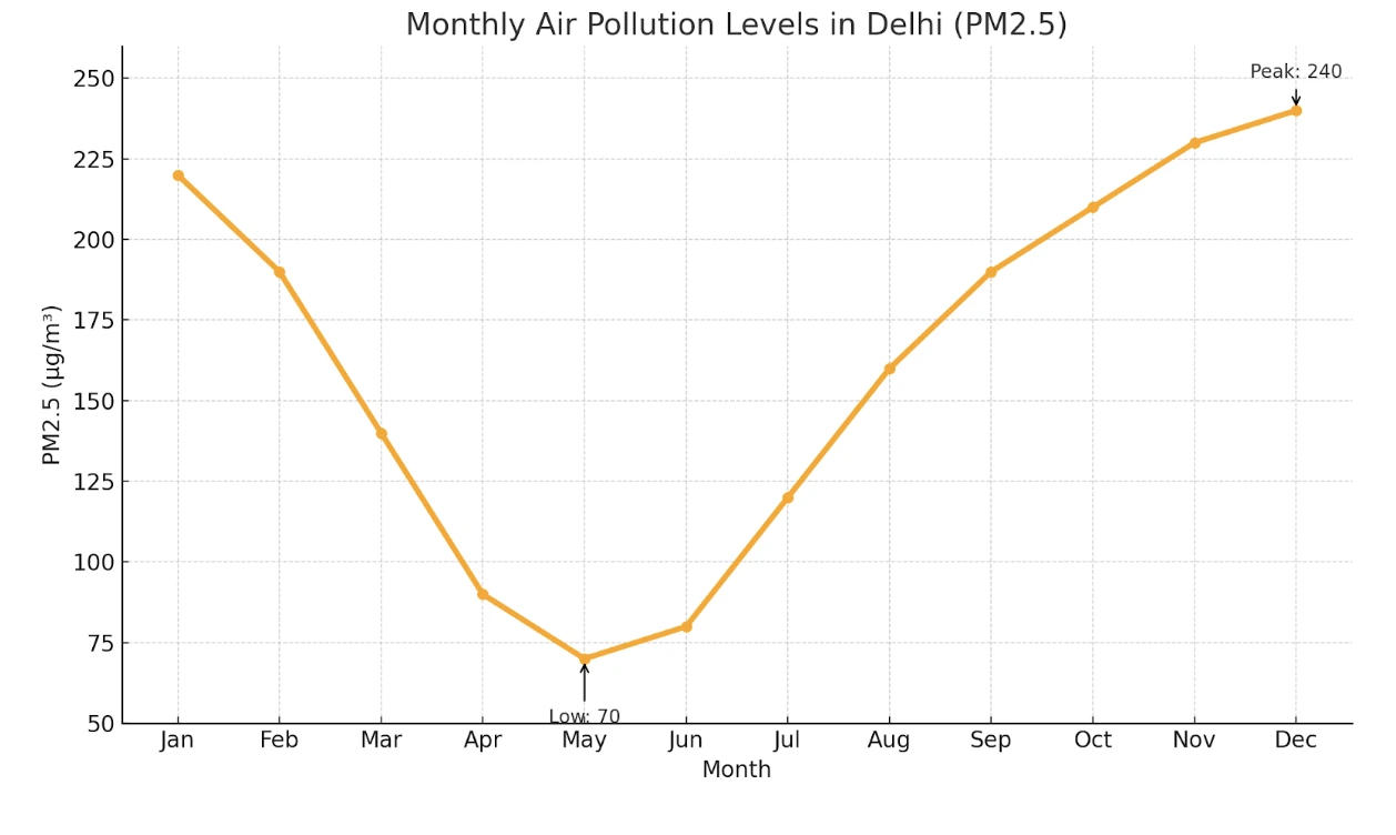
Look at the graph below. In 25 seconds, please speak into the microphone and describe in detail what the graph is showing. You will have 40 seconds to give your response.

30 community answers with AI feedback
30 community answers with AI feedback
SCORE 13/16

AI Feedback
AI Feedback
Content:
The response accurately describes the main features of the graph and identifies relationships between them, though it could provide more detail. Vocabulary is varied and used appropriately.
Oral Fluency:
The fluency is strong, with a good words-per-minute rate and no disfluencies, although there are some pauses that could be improved.
Pronunciation:
The pronunciation score is high, with minor inaccuracies present in word choice but overall clarity maintained.
SCORE 13/16
AI Feedback
AI Feedback
Content:
The response accurately describes the main features of the image, including the axes and pollution levels, but lacks some detail in relationships between features.
Oral Fluency:
The fluency is good, with a smooth flow of speech and appropriate pacing, though not perfectly seamless.
Pronunciation:
The pronunciation is mostly clear with minor errors, indicating a good level of proficiency.
SCORE 13/16
AI Feedback
AI Feedback
Content:
The response accurately describes the main features of the image, including pollution levels across different months, with minor details missing. The vocabulary is varied and appropriate.
Oral Fluency:
The speech flows well with a good pace, though there are some pauses that slightly affect the overall fluency.
Pronunciation:
Pronunciation is generally clear, with a few minor errors, but overall understandable.
SCORE 13/16
AI Feedback
AI Feedback
Content:
The description identifies the overall topic of air pollution levels in Delhi and covers key elements like months and pollution levels, but misses some details and relationships between the data points.
Oral Fluency:
The speech is mostly fluent with some pauses, but the flow is generally good.
Pronunciation:
Minor pronunciation errors are present, but the overall message is mostly clear.
SCORE 13/16
AI Feedback
AI Feedback
Content:
The overall topic of the image is clearly identified as a line graph showing monthly air pollution levels in Delhi. Most key elements are described, including the axes and specific pollution levels, but some relationships and trends, particularly regarding the peaks and troughs, could be explained more thoroughly.
Oral Fluency:
Speech is mostly fluent with some pauses; however, the flow is generally good and does not disrupt comprehension.
Pronunciation:
Pronunciation is mostly clear with minor errors, particularly in the terms 'PM 2.5' and 'Delhi', but does not significantly hinder understanding.
SCORE 13/16
AI Feedback
AI Feedback
Content:
The response accurately describes the main features of the chart and identifies relationships between them, but lacks some detail in expansion.
Oral Fluency:
The user demonstrates good fluency with only occasional pauses, maintaining a steady pace throughout the response.
Pronunciation:
The pronunciation is mostly clear with minor errors that do not significantly impede understanding.
SCORE 13/16
AI Feedback
AI Feedback
Content:
The overall topic of air pollution levels in Delhi is identified, and some key elements are described, but coverage is incomplete and relationships between trends are weakly explained.
Oral Fluency:
Speech is smooth and natural, with a good pace and no noticeable hesitation.
Pronunciation:
Pronunciation is mostly clear with minor errors affecting some numbers and words.
SCORE 13/16
AI Feedback
AI Feedback
Content:
The response accurately describes the main features of the chart, including specific pollution levels for different months, but lacks some detailed relationships between features.
Oral Fluency:
The speech flows well with good pacing and minimal pauses, though there are some slight hesitations.
Pronunciation:
The pronunciation is clear and mostly accurate, but there are minor issues that affect clarity.
SCORE 13/16
AI Feedback
AI Feedback
Content:
The user clearly identifies the overall topic of the image and describes several key elements, including the air pollution levels across different months. They mention specific trends, such as the peak in January and the lowest point in May, but miss some details and relationships between elements.
Oral Fluency:
Speech is mostly fluent with some pauses; the flow is generally good but could be improved.
Pronunciation:
Pronunciation is mostly clear with minor errors that do not significantly hinder understanding.
SCORE 13/16
AI Feedback
AI Feedback
Content:
The response accurately describes the main features of the image and identifies relationships, allowing the listener to build a clear mental picture. Some minor details could be improved.
Oral Fluency:
The speech flows well with a good pace, though there are minor pauses that slightly affect overall fluency.
Pronunciation:
The pronunciation is clear and mostly accurate, with some minor errors that do not significantly hinder understanding.
How to approach it
- Name the image. Say what type of chart or picture it is and what it measures.
- Give the overview first. State the highest and lowest, or the main idea, before any detail.
- Group, do not list. Cover two or three key points. Never read every number.
- Close with one comparison. End on the biggest contrast or the main takeaway.
Model Answer
the image shows a line graph of monthly air pollution levels in delhi. initially, the pollution level decreases from january to may, where it reaches the lowest point after may. the level steadily increases and reaches the highest value in december. overall, the trend indicates a fall followed by a sharp rise in pollution levels.