
Struggling with the bar graph PTE Describe Image task? With the right approach and a well-structured PTE bar graph template, you can confidently tackle this section and boost your speaking score.
Want to learn how? In this guide, we’ll share easy-to-follow templates, bar graph PTE samples, and expert tips to help you ace the Describe Image task!
The Describe Image task in PTE Speaking tests your ability to analyse and explain visual data quickly. You will see different types of images, including bar graphs, pie charts, line graphs, and process diagrams, and you must describe them clearly in 40 seconds.
Types of Images in Describe Image Task
In the Describe Image task of PTE Speaking, you may encounter various image types, including bar graphs, line graphs, pie charts, tables, maps, and process diagrams. Each type requires a structured approach to highlight key trends and comparisons.
Score 80+ in PTE with Leap’s Self-Prep Course
 1M+
1M+

 4.7
4.7

-
 100+ Video Lectures
-
Instant Score and Feedback
-
80+ Practice Questions


For bar graph PTE tasks, focus on the highest and lowest values, trends, and overall patterns. Using a PTE bar graph template can help structure responses effectively. Practicing with bar graph PTE samples ensures clarity and fluency in bar graph in PTE speaking tasks.
Understanding Bar Graph Questions in PTE
Bar graph questions in PTE Describe Image require test-takers to analyse a graphical representation of data and present a structured response within 40 seconds. A well-structured answer should highlight key trends, comparisons, and conclusions.
What is a Bar Graph Question?
A bar graph question in PTE Describe Image requires test-takers to analyse and summarise key trends, comparisons, and significant data points from a graphical representation. Let’s take a look at the factors that highlights Bar Graph PTE Tasks,
- A bar graph PTE question presents data in vertical or horizontal bars to compare different categories.
- The test-taker must describe key details like highest, lowest, and notable trends within the given time.
- Common variations include grouped bar graphs, stacked bar graphs, and single-category comparisons.
How It’s Scored in PTE
Bar graph responses in PTE are scored based on content accuracy, oral fluency, and pronunciation, with emphasis on structured delivery and clear speech. Let’s understand them one by one.
- Content (5 points): Covers the accuracy of the response, including mention of major trends and comparisons.
- Oral Fluency (5 points): Focuses on smooth and natural speech without hesitations or unnatural pauses.
- Pronunciation (5 points): Evaluates clarity and correct pronunciation of words.
Read More:
Step-by-Step Strategy to Answer Bar Graph in PTE
Effectively answering a bar graph in PTE requires a structured approach to analysing and describing the data. Following a strategic method ensures clarity, fluency, and coherence in your response.
The steps that you can follow to analyse and understand the question are:
Step 1: Carefully read the title and axis labels by reading the title of the bar graph to understand the main topic and try to look at the axis labels to measure the units used.
Step 2: Examine the highlights that explain the colours or patterns used in the graph.
Step 3: Try to Identify the main trends in the graph. Look for any significant increases and decreases in the graph.
Step 5: Identify any bar or points of particular interest that stand out from the general interest.
Step 6: Practise using comparison language to describe relationships between bars.
Step 7: Strategically structure your answer, starting with an introduction, providing an overview, and then moving into detailed descriptions of individual bars.
How to Describe Trends & Data Clearly in PTE Bar Graphs
In the Describe Image section of the PTE Speaking test, bar graphs are one of the most common question types. A well-structured response requires a clear explanation of trends and data without unnecessary details. Below are key strategies to effectively describe trends in PTE bar graphs.
1. Identify the Key Features
Before describing the data, analyse the bar graph carefully. Identify the:
- Title – Understand what the graph represents.
- X-axis and Y-axis – Look at the labels, units, and categories.
- Trends and Patterns – Observe increases, decreases, stability, and fluctuations.
- Highest and Lowest Values – Note the peak and least significant data points.
2. Use the Right Vocabulary for Trends
Using appropriate vocabulary makes your response more fluent and precise. Below are some key phrases to describe different trends:
For an Increase:
- “The value rose sharply from X to Y.”
- “There was a gradual increase in…”
- “The numbers grew steadily over time.”
For a Decrease:
- “The figure declined significantly from X to Y.”
- “A sharp drop was observed in…”
- “There was a steady decline in…”
For Stability:
- “The trend remained constant throughout the period.”
- “There was no significant change in…”
- “The figures stayed steady at X.”
For Fluctuations:
- “The data fluctuated between X and Y.”
- “A slight variation was observed in…”
- “The numbers went up and down irregularly.”
3. Compare the Data Effectively
Bar graphs often display multiple categories, making comparisons essential. Use these phrases to compare different data points:
- “X was higher than Y throughout the period.”
- “The number of students in Engineering exceeded that in Arts by 5,000.”
- “The highest figure was recorded in 2022, while the lowest was in 2018.”
4. Structure Your Response for Clarity
A well-structured answer helps in achieving a high score. Use the following example format:
Introduction:
- “The given bar graph represents [topic] over [time period].”
Main Description:
- “Overall, it is observed that [highlight major trend].”
- “The highest value is seen in [category] at [data point].”
- “The lowest figure appears in [category] at [data point].”
Conclusion:
- “In summary, [overall trend or significant pattern].”
Read more:
Bar Graph PTE Template for High Scores
In the Describe Image section of the PTE Speaking test, using a structured approach is essential to delivering a high-scoring response. A well-organized bar graph PTE template ensures fluency, clarity, and accuracy while describing trends.
Easy-to-Use PTE Bar Graph Template
To score well, follow this 3-part structured template when describing bar graphs in PTE:
1. Introduction (5-7 seconds) → Describe What the Graph Represents
- Start by stating what the bar graph is about, including the title, categories, and time period (if given).
- Keep it concise and clear.
Template Examples:
- “The bar graph illustrates the comparison of X across different categories/time periods.”
- “This bar chart represents data about Y, measured in units, over the period Z.”
2. Key Trends & Data (20-25 seconds) → Describe the Major Observations
- Identify the highest and lowest values in the graph.
- Compare different categories or time periods.
- Highlight trends (increase, decrease, fluctuation, stability).
- Avoid mentioning every data point; focus on key trends.
Template Examples:
- “It is evident that X has the highest value, whereas Y has the lowest.”
- “From year A to year B, the trend of X shows a steady increase, while Y fluctuates.”
- “The data indicate a peak in Z, followed by a sharp decline in year.”
3. Conclusion (5-7 seconds) → Summarize the Overall Trend
- Provide a final observation or summarise the general trend.
- Avoid adding new information.
Template Examples:
- “Overall, the data suggest a general increase/decrease in X over time.”
- “To summarise, while X had the highest value, Y remained the lowest.”
Best Sentence Structures for Describing Trends
Using varied and precise sentence structures enhances clarity and fluency. Below are some effective sentence patterns for describing bar graph trends:
1. Describing Highest & Lowest Points
- “The highest value is observed in X, while the lowest is in Y.”
- “X peaked at number, making it the most significant category.”
2. Comparing Two or More Categories
- “X is significantly higher than Y, showing a percentage difference.”
- “Compared to X, Y had a lower figure throughout the period.”
3. Describing Increases
- “X increased steadily from A to B, reaching number.”
- “A noticeable rise is seen in X, growing by percentage/number.”
4. Describing Decreases
- “X experienced a gradual decline, falling from A to B.”
- “A significant drop was observed in Y, decreasing sharply after year.”
5. Describing Fluctuations & Stability
- “The trend of X fluctuated between A and B, showing no clear pattern.”
- “X remained stable throughout the period, with minor variations.”
Sample Answers for Bar Graph PTE
Simple Sample Answer:
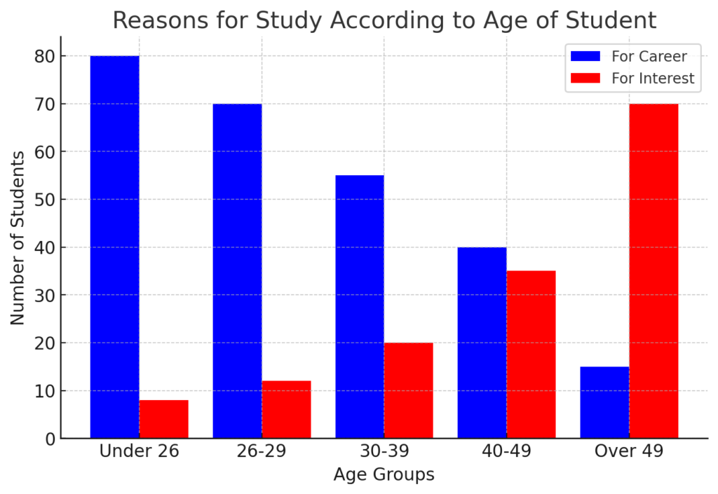
The bar graph presents the reasons for studying among different age groups, categorised as “For Career” and “For Interest.” Younger students, particularly those under 26, primarily study for career growth, with over 80% falling into this category. As age increases, the percentage of career-driven learners declines, while interest-based study rises. The trend reverses completely in the “Over 49” age group, where the majority study out of personal interest rather than career progression. Overall, the data suggests that professional development is a key motivator for younger students, whereas older individuals pursue education for personal enrichment.
High-Scoring Answer:
The bar graph illustrates the primary reasons for studying among different age groups, distinguishing between career-driven and interest-driven motivations. It is evident that younger individuals, particularly those under 26, overwhelmingly pursue education for career advancement, with approximately 80 students in this category. This trend remains dominant in the 26-29 and 30-39 age groups, though there is a gradual rise in interest-based studying. However, in the 40-49 age group, the gap between the two motivations narrows significantly, with nearly equal numbers of students studying for career and interest. Notably, in the over 49 category, the primary motivation shifts entirely, as the majority of students in this age group study for personal interest rather than professional growth. This data suggests that career-oriented studying is more prevalent among younger individuals, whereas older learners are more inclined towards education for personal enrichment.
Read more:
Common Mistakes & How to Avoid Them in PTE Bar Graphs
When attempting the Describe Image task for bar graphs in PTE, test-takers often make common mistakes that lower their scores. Below are the frequent errors and tips to avoid them.
1. Speaking Too Slowly or Too Fast
How to Avoid: Maintain a moderate speaking pace. Speaking too fast can lead to pronunciation errors, while speaking too slowly may indicate hesitation.
2. Giving a Detailed Analysis Instead of a Summary
Mistake: Trying to describe every single number or data point instead of focusing on key trends.
How to Avoid: Summarise the most important trends, highest/lowest values, and general patterns. Avoid unnecessary details.
3. Incorrectly Interpreting the Graph
Mistake: Misreading the axes, categories, or values and providing incorrect data interpretation.
How to Avoid: Spend a few seconds analysing the title, X-axis, and Y-axis before speaking. Identify highs, lows, and trends correctly.
4. Lack of Comparative Language
Mistake: Only stating the values without making comparisons.
How to Avoid: Use comparative phrases like:
- “X is higher than Y by 5%.”
- “The trend in A is similar to that in B.”
5. Poor Sentence Structure & Grammar Errors
Mistake: Using incorrect grammar or sentence structures, making the response unclear.
How to Avoid: Use simple and structured sentences, such as:
- “The highest percentage of sales was recorded in 2021.”
- “There was a steady increase in population from 2010 to 2020.”
6. Running Out of Time
Mistake: Spending too much time on the introduction or minor details, leading to an incomplete response.
How to Avoid: Follow a structured approach and practice speaking within 40 seconds:
- Intro (5 seconds): “The bar graph illustrates…”
- Key Trends (25 seconds): Describe the highs, lows, and overall pattern.
- Conclusion (5-10 seconds): Summarize the trend.
7. Pausing or Hesitating Frequently
Mistake: Using too many pauses or filler words like “um,” “uh,” or “you know.”
How to Avoid: Practice speaking fluently with confidence. Use simple sentences and avoid overcomplicating the description.
8. Not Using Proper Vocabulary for Trends
Mistake: Repeating the same words like “increase” and “decrease” without variation.
How to Avoid: Use synonyms and varied expressions:
- Increase: rose, grew, surged, climbed, peaked
- Decrease: dropped, declined, plummeted, fell, dipped
- Stable: remained constant, stayed steady
- Fluctuation: varied, fluctuated, showed ups and downs
9. Mispronouncing Key Words
Mistake: Incorrect pronunciation of numbers, percentages, or trend-related vocabulary.
How to Avoid: Practice saying numbers clearly and rehearse trend-related vocabulary before the exam.
10. Not Sending a Clear Message in the Conclusion
Mistake: Ending abruptly or failing to provide an overall summary.
How to Avoid: Conclude with a summary sentence like:
- “Overall, sales showed a consistent upward trend.”
- “In summary, the highest revenue was recorded in 2020, while 2015 had the lowest sales.”
Read more:
Conclusion
Mastering the Bar Graph PTE Describe Image task is essential for achieving a high score in the PTE Speaking section. A structured approach using a well-defined PTE bar graph template can help you present key trends, comparisons, and insights effectively within the given time.
By practicing with different bar graph PTE samples and refining your ability to analyse data quickly, you can enhance your fluency and accuracy. Understanding how to interpret a bar graph in PTE speaking and structuring your response with clarity will significantly improve your performance.
Let Leap Scholar help you master it! Get expert guidance, access to a structured PTE bar graph template, and practice with bar graph PTE samples to improve your fluency and accuracy.
Join us today and boost your PTE score with confidence!
Frequently Asked Questions
-
Q. How to explain a bar graph in PTE?
Ans. In the Bar Graph PTE Describe Image task, you need to analyse the given graph, highlight key trends, and compare data points within 40 seconds. Start with an introduction (e.g., “The given bar graph illustrates…”), mention highs and lows, and conclude with an overall trend. Speaking fluently without long pauses is crucial for scoring well.
-
Q. How to read graphs in PTE?
Ans. To read a bar graph in PTE, focus on the title, x-axis, y-axis, categories, and key figures. Identify major trends, highest and lowest values, and any notable patterns. Quickly grasping the data structure will help you organise your response effectively during the speaking task.
-
Q. How to describe a picture in the PTE exam sample?
Ans. In the PTE Describe Image task, start with a brief introduction (“The image shows…”), mention important details like trends, differences, or patterns, and conclude with an overall observation. Use structured language and avoid long pauses to ensure fluency.
-
Q. How to improve PTE Describe Image?
Ans. To improve in PTE Describe Image, practice with various types of images like bar graphs, line charts, maps, and pie charts. Use a structured template, focus on key details, and speak fluently without hesitation. Regular mock tests and feedback analysis can enhance your performance.
-
Q. What is the best template for describing an image in PTE?
Ans. A simple and effective PTE Describe Image template follows this structure:
Introduction: “The given bar graph represents [topic] over [timeframe].”
Key Observations: “The highest value is… while the lowest is…”
Comparison: “There is a significant increase/decrease in…”
Conclusion: “Overall, the trend shows…” -
Q. What is Describe Image vocabulary in PTE?
Ans. Some useful Describe Image vocabulary words include:
Increase/decrease: “Rises, surges, drops, declines”
Comparisons: “Higher than, lower than, equal to”
Trends: “Steady growth, fluctuating trend, rapid decline”Using varied vocabulary helps improve your fluency and content score.
-
Q. What is the Image Description Task in PTE?
Ans. The Image Description task in PTE Speaking requires you to analyse and describe bar graphs, pie charts, line graphs, maps, and diagrams within 40 seconds. You are scored on content, fluency, pronunciation, and clarity. Using a structured response helps improve your score.
-
Q. How do you describe a diagram in PTE?
Ans. To describe a diagram in PTE, first mention the title and main components, then explain the key observations and relationships between elements. Use linking phrases like “it highlights,” “it represents,” or “it compares” to ensure a smooth and coherent response.
-
Q. What is image description in PTE?
Ans. Image Description in PTE is part of the Speaking section, where test-takers must analyse graphs, charts, maps, or diagrams and describe them in a structured manner within 40 seconds. The key to scoring well is fluency, pronunciation, and logical explanation.
-
Q. How much time do I get to describe an image in PTE?
Ans. In the PTE Describe Image task, you get 25 seconds to prepare and 40 seconds to speak. Using a template-based approach can help structure your response quickly and effectively.
-
Q. Why is the Describe Image task important in PTE?
Ans. The Describe Image task tests your oral fluency, pronunciation, and ability to analyse visuals under time pressure. It contributes significantly to your overall PTE speaking score. Regular practice with bar graphs and other image types is essential for a high score.


Have Questions? Get Guidance to reach your Dream University
Connect with India's finest counsellors and biggest study abroad community.
Get Guidance